Illustrative example · Sample data
Dashboards
How to Turn Excel Data into an Editable Dashboard
A practical path from a spreadsheet to a report you can check, change, share and use again next month.
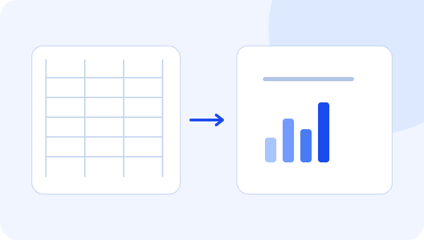
An editable Excel dashboard is more than a collection of charts. It is a report whose data, metrics, filters and layout you can revise without recreating the whole result. The useful starting point is not “make a dashboard.” It is a business question and a spreadsheet with a clear structure.
This guide uses a small, fictional sales example. The figures are sample data, not a customer result.
Start with a question and a defined row
Suppose your question is: “How did revenue change from July to August, and which region contributed most to the change?” You need a period, a region and a revenue amount. You also need to know what one row represents.
In this example, each row represents one region in one month. It is not an individual invoice. That means the data can support monthly regional analysis, but cannot answer questions about invoice counts, customers or products. A dashboard cannot recover details the source does not contain.
Month | Region | Revenue (USD) |
|---|---|---|
July 2026 | North | 34,000 |
July 2026 | South | 28,000 |
July 2026 | East | 27,000 |
July 2026 | West | 25,000 |
August 2026 | North | 42,000 |
August 2026 | South | 31,400 |
August 2026 | East | 30,000 |
August 2026 | West | 25,000 |
Prepare the file before asking AI to design anything
Keep one header row and consistent column names. Store dates as dates and amounts as numbers. Avoid merged headings, blank separator rows and subtotal rows mixed with the underlying data. If July appears as both a set of regional rows and a separate “July total” row, summing the entire column would count the month twice.
Keep the meaning of each column explicit. “Revenue” might mean invoiced revenue, recognized revenue or cash collected. Choose the definition this report uses and label it accordingly. If the file combines currencies, resolve that before displaying a single total.
For a first report, use the smallest clean dataset that answers the question. You can expand the scope after the first totals reconcile.
Define the measures you will check
The sample gives July revenue of $114,000 and August revenue of $128,400. The increase is $14,400. Dividing that increase by July revenue gives 12.6%, rounded to one decimal place.
North increased by $8,000, so it contributed the largest amount to the total change. That is a numerical contribution, not an explanation of why it happened. You would need additional evidence to attribute the increase to a campaign, a salesperson or a new contract.
Write down these expected answers before generating the dashboard. They become simple checks for the model, visuals and later data questions.
Give the report generator a specific brief
A useful prompt is:
Create a monthly sales dashboard from this regional dataset. Show total revenue, the change from July to August, revenue by region and each region’s contribution to the change. Label amounts in USD. Do not show customer or product metrics because those fields are not in the data.
Specific instructions make the output easier to review. They do not replace review. Check the total, period selection and calculation before improving the colors or layout.
Edit the result for the actual conversation
Use a trend or comparison view for the two months and a regional breakdown for the contribution. Keep the period and currency visible. Remove a visual if it repeats the same answer without adding context.
An editable report lets you change a chart type, add a filter or rearrange the page after someone sees the first version. That feedback is part of making the report useful, not evidence that the first generation failed.
In Timeliq, the intended workflow combines supported Excel/CSV input, AI-assisted modeling, report generation and visual editing. Review your source structure and the resulting metrics before inviting other people.
Test the next reporting cycle
Add the next month using the same structure, refresh or replace the source through the supported workflow, and check that the saved report still behaves correctly. Renamed columns, changed data types or a different row meaning can require adjustments.
Then give one colleague access and ask them to find the answer without your explanation. That test connects a correct dashboard to a usable reporting process.
Explore Timeliq’s dashboard features, then read how to share dashboards securely. The goal is a report your team can return to—not just a chart that looks good once.
Keep exploring
AI-Generated Dashboards vs. Ongoing Business Reporting
Generating a first dashboard is one step. Learn what changes when the report needs to survive new data, new users and the next meeting.
How to Share Business Dashboards Securely with Your Team
Use a report catalog, explicit permissions and a small access test to make sharing more useful without treating every link as authorization.
Put the idea to work with your own reporting.
Explore how Timeliq brings editable dashboards, sharing and data questions together.